


Oct 18, 2016
Excel 2016 has a very handy new feature that enables you to create a quick forecast from a list of dates and their associated figures. It also automatically plots them on a column or line chart for you!
To create this forecast, the process is simple:
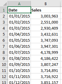
- Lay out the data in the appropriate format with dates in the first column and data in the second. For example, like this:
- Select the data.
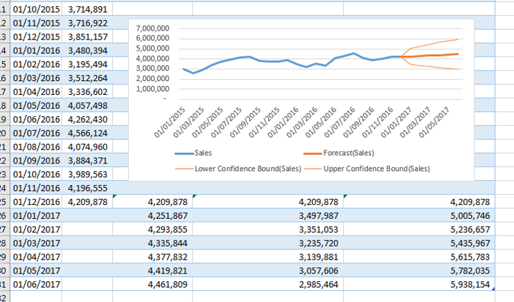
- Go to the Data tab on the Ribbon and click the Forecast Sheet button. A preview of the chart is shown and can be changed to a column chart with the button at the top-right of the dialog box. Note: There are other options that can be customized; click the Options button at the lower-left to find these.
- Click OK and a new sheet is added to the workbook with the forecasted figures and chart.
For more information, take a look at our Excel training courses.
How do your Excel skills stack up?
Test NowRelated Articles


About the Author:
Ben Kirk

With over 16 years of experience working as a Desktop Applications specialist for a number of large education services providers, Ben is one of New Horizons most skilled and dynamic instructors. With his Advanced Diploma of Business Skills alongside his practical experience and expertise, Ben is able to provide insight and guidance to students at all skill levels across the entire Microsoft Office suite.
Read full bio


Next up:
- Outlook on the Web in Exchange Server 2016
- Does good design sell itself?
- I'll have courtesy with my gelato, thanks.
- 6 conversations a new manager should have
- Updates to Angular 2 that makes coding easier – HTTP Client
- Define and solve a problem by using Excel Solver
- Seven steps to modifying employee behaviour
- Master Document in Word – Part 1
- OneDrive to rule them all
- Finally, technology proves the benefits of face-to-face interaction
Previously
- Outlook on the Web in Exchange Server 2016
- Life has many, many stations. Having trouble getting to your next one?
- Updates to Angular 2 that makes coding easier – Custom Pipes
- Data Recovery in Windows Server 2016
- Interviewing and avoiding the artful dodger!
- Remove all hyperlinks from an Excel sheet using VBA
- Your essential guide to performance feedback
- PRINCE2® Agile – Enhancing your project delivery
- Working with Styles – Part 5
- Microsoft Project 2013 & 2016: Levelling Gantt
